
Color With Purpose: How Accent Flooring Shapes Commercial Interiors

Color has always had a place in commercial interiors. What continues to evolve is how we use it.
Today’s broader range of flooring visuals, textures, patterns, and coordinating colorways gives the design community more freedom to think beyond color as simply a decorative choice. It can be layered into an interior with intention—helping define spaces, create visual interest, reinforce identity, or bring energy to a specific area.
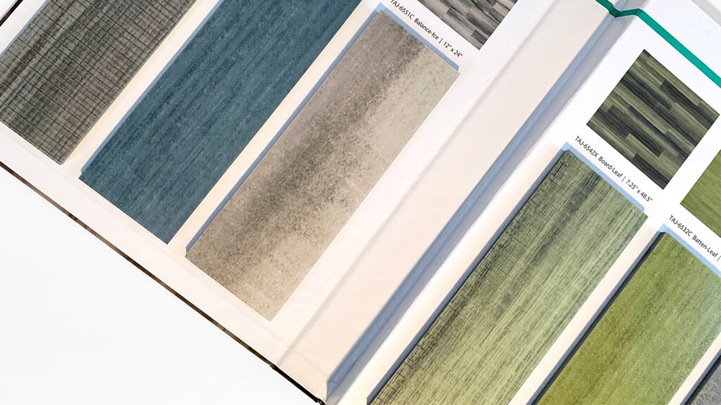
In flooring, that might mean a warm wood visual extending throughout a space while a saturated, textile-inspired color identifies a collaboration area. A stone or concrete visual might establish the primary floor plane while a contrasting color highlights an entrance, destination, or transition. Pattern and coordinating colorways can create even more opportunities to connect these areas visually.
With the variety of commercial flooring options available today, color can be subtle or expressive, used broadly or in just the right place.
How Is Color Used in Commercial Flooring?
Color in commercial flooring can help define different areas, support a brand or institution’s identity, highlight destinations, create visual landmarks, and make wayfinding easier. Pair colorful flooring accents with neutral wood, stone, concrete, or textile looks. This approach adds personality while keeping the overall space cohesive and simple:
Neutral foundation plus intentional accents, texture, and pattern
The focus shifts from whether to use color to where it can make the biggest difference.
Color Can Do More Than Decorate
Flooring covers a large part of any interior, so changes in color, pattern, and texture become powerful design tools.
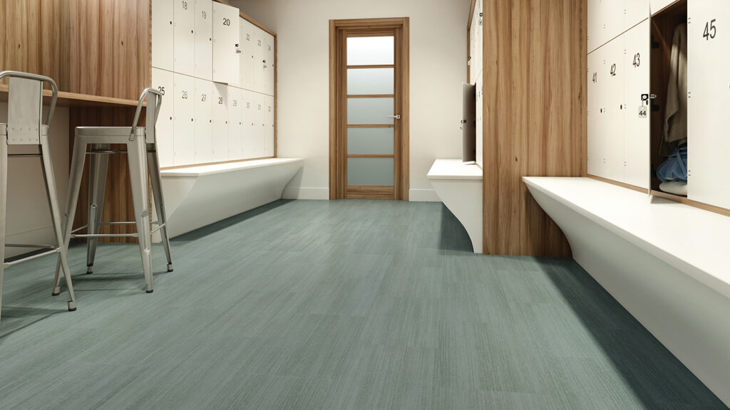
Color Infused Modular Acoustic Flooring, Batten Daybreak | 5MM LVT
When used thoughtfully, flooring color can help:
- Distinguish destinations and transition points.
- Establish functional zones within open spaces.
- Support brand, school or institutional identity
- Create recognizable visual landmarks.
- Add energy to collaborative environments.
- Differentiate circulation from gathering areas.
- Bring personality into predominantly neutral interiors.
Color can also help with wayfinding, especially when combined with signage, architecture, lighting, and environmental graphics. Flooring doesn’t have to replace a full wayfinding system. Instead, changes in flooring color and pattern can serve as visual cues that help people understand and navigate space.
Education: Creating Places Students Recognize
Schools are a great example of how color can be used to organize spaces.
Modern schools often have flexible classrooms, collaboration areas, media centers, STEM spaces, commons, and breakout zones. Flooring can help visually separate these areas while keeping the building’s look consistent. Color can also highlight classroom entrances, hallways, cafeterias, breakout spaces, and grade-level areas.
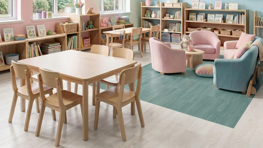
Color Infused Modular Acoustic Flooring, Batten Ice paired with Wavelength Modular Acoustic Flooring, Shabby Chic | 5MM LVT
School colors are another good starting point. Instead of using them everywhere, designers can add them in key spots to reinforce identity and create a stronger sense of place.
This way, the flooring remains practical and unified, while color helps students know where they are and what activities happen in each area.
Healthcare: Using Color to Create Visual Cues
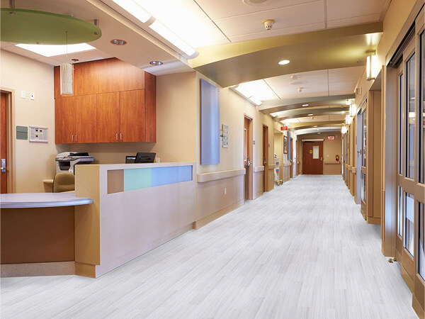
In healthcare settings, color serves a different purpose. Here, the goal may be less about creating energy and more about supporting recognition, reassurance, orientation, and identity. A mostly neutral floor can be accented with color around patient destinations, waiting areas, nurses’ stations, elevators, therapy spaces, pediatric departments, or between departments. This approach helps flooring support wayfinding and adds warmth and personality to spaces that might otherwise feel too institutional.
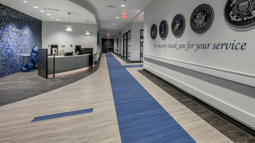
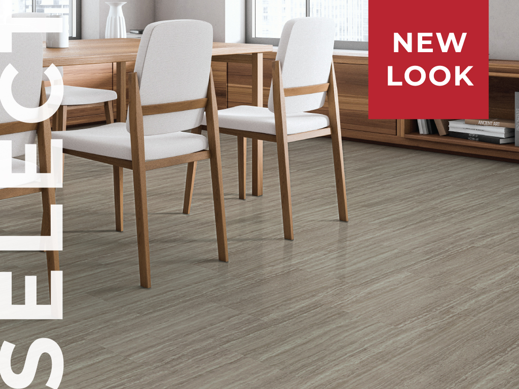
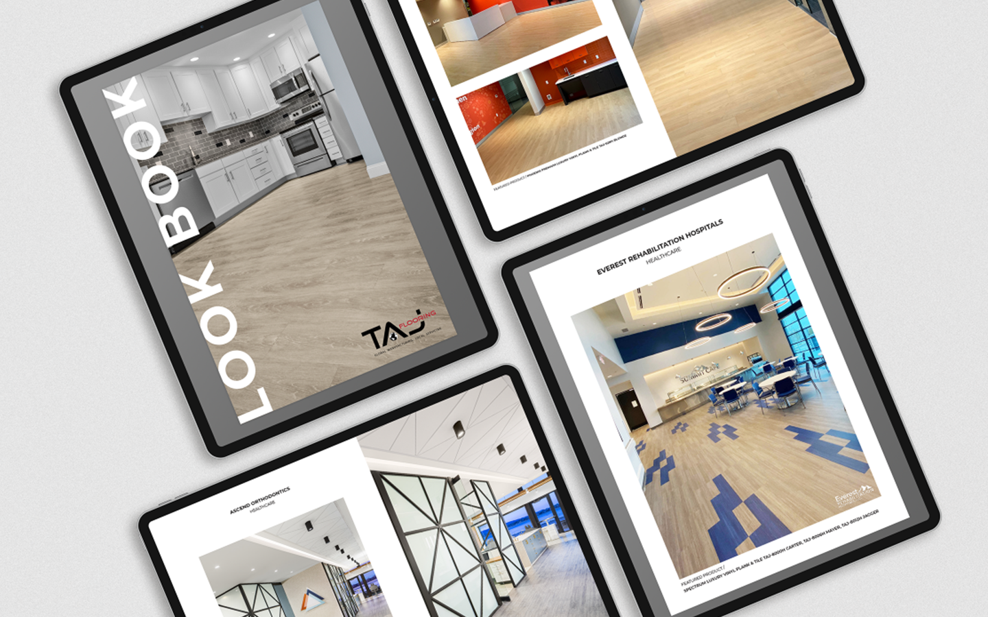
Select Luxury Vinyl Flooring Carter, Strait and Jagger | 3MM
Design Consideration: Contrast With Care
More contrast is not always better.
In healthcare and senior living spaces, flooring color, pattern, and transitions should be chosen with the needs of the people using the space in mind. People with visual or cognitive impairments may see strong contrasts, patterns, and flooring changes differently.
Accent flooring should be seen as just one part of the whole environment, along with lighting, signage, architecture, graphics, and accessibility needs.
When used thoughtfully, color can create clear visual cues without overwhelming the space.
Corporate Offices: Bringing Energy Back to the Workplace
As corporate offices continue to evolve, color can play an important role in making workplaces feel more engaging, welcoming, and connected to company culture. Rather than relying on one flooring visual across an entire office, designers can use shifts in color, pattern and texture to give different spaces their own identity.
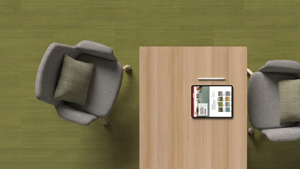
Color Infused Modular Acoustic Flooring, Batten Leaf | 5MM LVT
A neutral wood, stone or textile-inspired floor might establish continuity throughout the workplace, while more expressive flooring can help distinguish:
- Collaboration and brainstorming areas
- Employee lounges and cafés
- Meeting and conference spaces
- Reception and client-facing areas
- Breakout and touchdown spaces
- Circulation paths and departmental zones
This approach is especially useful in open and flexible offices, where flooring can create visual boundaries without adding walls. A change in color beneath a collaboration area, for example, can signal that the space is meant for gathering while still being connected to the surrounding workplace.
Color can also reflect brand identity without making the environment feel overly branded. Instead of matching a corporate color literally, designers can draw from complementary tones, textures, and patterns that express the organization’s personality more subtly.
As workplaces become more varied in how they are used, flooring offers another layer for forming spaces employees can recognize, navigate, and enjoy.
In the workplace, color can connect, energize, and define.
Retail: Creating an Atmosphere Through Color
In retail environments, color can help set the tone for the entire shopping experience. Flooring is part of the visual landscape customers encounter from the moment they enter a store, giving designers an opportunity to use color, pattern and texture to reinforce the atmosphere they want to create.
Color can extend throughout an entire store to establish a recognizable identity, or it can be introduced more selectively to distinguish departments, highlight displays, define service areas and create visual destinations. Changes in flooring can also help guide customers naturally from one environment to another without relying solely on walls or signage.
The color itself can support the purpose of the space. Warm, natural tones can create a sense of comfort and familiarity, while brighter or more saturated colors can bring energy to an experiential or promotional area. Colors inspired by nature can feel especially relevant in environments centered around wellness, food and fresh products.
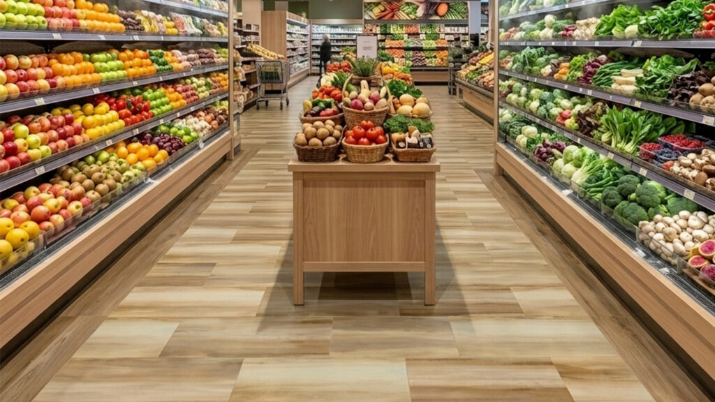
Color Infused Modular Acoustic Flooring, Balance Daybreak | 5MM LVT
In a grocery produce department, for example, Balance Daybreak introduces a warm, sunlit quality beneath the displays. Its golden, natural tones complement the colors of fresh fruits and vegetables while helping evoke ideas of sunshine, health and growth. It is one example of how the flooring palette can reinforce the story of the environment rather than simply serve as a backdrop.
Whether color establishes the atmosphere of an entire store or creates a moment within it, thoughtful flooring choices can help make the shopping environment more distinctive, intuitive and memorable.
Pairing Color With Neutral Flooring
Adding color does not mean giving up the warm woods, stones, and organic neutrals that define today’s commercial interiors.
In fact, these materials can make colorful accents stand out even more.
A deep blue next to warm oak feels different than a whole blue floor. A rich green surrounded by soft concrete tones becomes a visual focal point. Terracotta or rust accents can add to the warmth of a natural wood palette.
One way to approach this is to think about proportions.
Let neutral flooring cover most of the space, while color acts like punctuation, showing up where designers want people to notice, gather, move, or interact.
This approach also creates a more flexible design language. The main flooring lasts over time, while well-placed accents add identity and personality.
Making Color Easier to Specify
TAJ developed the Accents Swatch Kit with this idea in mind: color does not have to dominate a commercial interior to make an impact.
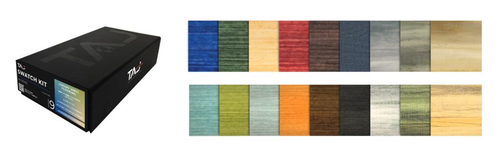
Accents offers a curated selection of expressive luxury vinyl designs from Select, Color Infused, and Wavelength, including the popular Filo Denim. The kit explores color through textile-inspired visuals, patterns, textures, and coordinating colorways, giving designers an easy way to move beyond an all-neutral floor.
With options in both 3mm and 5mm thicknesses, designers can consider color along with different performance and application needs.
The goal is not just to show a collection of colorful flooring.
It is to make it easier to ask a more interesting design question:
Where does color belong?
Whether the answer is a school commons, pediatric waiting area, retail destination, collaborative workplace, or just a small moment in a larger neutral space, a well-placed accent can change how people experience the space.
Explore the TAJ Accents Swatch Kit →
